All stories · Article
A good-looking store can still be hard to buy from
Share: WhatsApp · Telegram · X · Facebook · LinkedIn · Email
A complete beginner on the Shopify Community forum has traffic, no sales and no add-to-carts, and guesses the store "doesn’t look professional." Shopify CRO designer @SammyLandix4o sees a wider pattern: "Most ecommerce stores look good but don’t sell." When shoppers leave before the cart, the leak is usually the message and the friction, not the look.
The redesign reflex blames what is easiest to see
Design is the easy suspect because it is the part of a store anyone can judge at a glance. A shipping cost that never shows up, or a size picker that confuses, only reveals itself when someone tries to buy.
Shopify developer @WaqarAhm4d wrote about a store where that reflex played out. The owner blamed the low conversion rate on the design. @WaqarAhm4d's call was to leave the design alone. "Not yet." The real problems sat somewhere else.
For a new store, the symptom can look like a post from a new haircare brand on the same forum: 3 days, 81 visitors, no customer sales yet. Those numbers say shoppers showed up. Something between the first page and the cart stopped them, and the theme is only one suspect among several.
Pretty pages still leave shoppers guessing
@Heckstechie_, who builds ecommerce sites, lists beautiful typography, beautiful animations and beautiful sections, then adds the catch. If customers still have no idea what to do next, it is bad business. "Good design ≠ good business."
The gap shows up most clearly on the product page. Conversion designer @johntech778 puts it bluntly: "Your product page can look beautiful and still lose sales." The causes in that post are words, not visuals. The headline doesn't speak to the customer's problem. The benefits don't build desire. The page never removes objections. Visitors leave before they reach Add to Cart.
In a second post, @johntech778 frames the same loss as missing reasons: visitors don't have enough reasons to trust, understand and want the product. The list behind it is weak messaging, poor hierarchy, no objection handling and too much friction before Add to Cart.
Hierarchy is a design problem. The rest is copy and proof. A theme can frame the reasons to buy. It can't write them.
The leaks a nice theme hides
Two practitioners who looked at real stores came back with lists that overlap. These are the five problems @WaqarAhm4d found in the store above:
Waqar | Shopify Developer@WaqarAhm4dI wouldn't redesign this Shopify store.
Not yet.
The owner blamed the low conversion rate on the design.
But the real problems were:
❌ Weak value proposition
❌ Hidden shipping info
❌ Confusing variants
❌ Buried reviews
❌ Mobile frictionSep 10, 2026 · View on X
Shopify designer @Olu_Abiodun01 ran a quick audit of a Shopify site an owner built with AI assistance. The site looked fancy. But the homepage was slow, the product page had no FAQs or reviews, important policy pages were still templates, and the brand contact email was a Gmail address.
Put together, the leaks fall into six groups:
- Value proposition. The page doesn't make clear what the product does for the buyer (a weak value proposition, per @WaqarAhm4d).
- Shipping. Shipping info is hidden (@WaqarAhm4d).
- Variants. The options confuse instead of guide (@WaqarAhm4d).
- Reviews and answers. Reviews are buried (@WaqarAhm4d), or missing along with FAQs (@Olu_Abiodun01).
- Trust and policy. Policy pages are still templates and the contact email is a Gmail address (@Olu_Abiodun01).
- Mobile and speed. Mobile friction (@WaqarAhm4d) and a slow homepage (@Olu_Abiodun01).
None of the six is a color, a font or an animation. @Olu_Abiodun01 sums it up in one line: "E-commerce is not so forgiving." The bar in that post is whether a site builds trust and helps people buy, not only whether it looks good.
What a conversion-minded redesign actually changes
When designers who sell conversion work show a redesign, the changes they point to are mostly content. @SammyLandix4o's redesign adds a clear offer, product focus, trust badges, social proof and a strong CTA. The post's point is that design's job is to sell, and decoration comes second.
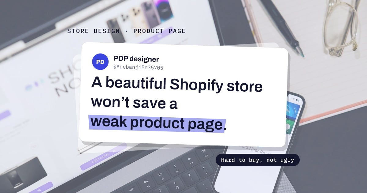
PDP designer @AdebanjiFe35705 makes the same argument from the product page: "A beautiful Shopify store won’t save a weak product page." For a skincare brand's PDP, the focus was clear benefits, bundle offers, trust signals and stronger CTAs.
Both posts are designers showing their own work, so the lists describe what practitioners reach for, not measured results. Still, the overlap is hard to miss. A conversion-minded redesign is a design job, but what it adds is an offer, proof and a clear next step. That is the same logic behind putting a redesign on hold until the leaks are fixed.
Check these before paying for a redesign
One question separates an ugly store from a hard-to-buy one: can a stranger understand the product, trust the store and reach checkout without guessing? If the answer is yes and the store still looks dated, design may well be the next job. If the answer is no, a new theme carries the same leaks into a new layout.
Before booking a redesign, run through your own store:
- Headline. Read the product page headline. Does it name the problem the product solves, or only the product?
- Shipping. Can you find shipping cost and delivery time before Add to Cart?
- Variants. Tap every option. Is it obvious what each one changes?
- Reviews. Do reviews sit near the buy button, and does an FAQ answer the obvious objections?
- Policies and contact. Are the policy pages written for your store, or still templates? Is the contact email on your own domain?
- Speed. Do the homepage and product page load quickly on a phone?
Then run the one test that covers all six at once. Pick up your phone, open the store the way a shopper from an ad would, and buy one product all the way to checkout. Every spot where you stop, scroll back or hesitate is where the fix starts.