All stories · Article
CSS code from a forum: 4 steps before you use it on your Shopify store
On October 25, the owner of an art print store posted two questions to the Shopify Community, a few hours apart. The first asked how to center the email newsletter form on a dedicated page.
Share: WhatsApp · Telegram · X · Facebook · LinkedIn · Email
The second asked why prices still showed in British pounds (GBP) after switching countries.
Both got answers the same day, and the two fixes could hardly be more different. A few lines of CSS pasted into that one section centered the email form. The currency problem needed no code at all.
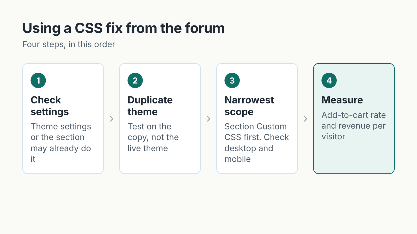
Between them, those two answers cover the first two steps of any small design fix: check the built-in settings, and paste code into the narrowest place that works. Other forum threads fill in the remaining two: test on a copy of your theme, and only keep a change when your sales numbers improve.
1. Check the settings before you look for code
In the currency thread, the owner had added a country selector to the header, yet every country showed GBP. The person who replied explained that the selector was working fine: currency comes from Settings > Markets, not from the theme, so if every country is set to GBP, GBP is what shows everywhere. They also pointed out that a store needs Shopify Payments to be able to sell in multiple currencies.
Another owner on the Dawn theme wanted size buttons as bordered squares, like the Add to cart button. One reply said most of this can be done without code, by adjusting Border thickness, Border opacity and Corner radius under Theme settings > Variant pills. CSS was only needed to make the boxes the same size.
Code you add yourself can break after a theme update, as the person who posted code in the Enterprise theme thread warned.
2. Test on a theme copy, because the demo store isn't your store
When the settings don't go far enough, forum code is often the quick fix, as long as you try it on a duplicate of your theme first. Between late September and mid-October, at least three people on the Shopify Community gave this advice: the person who posted code in the Enterprise thread, one reply in a Royce theme thread, and the author of a quick how-to on fixing color contrast.
The advice has a reason behind it. In a Dawn theme thread, an owner wanted the price next to the product title on collection pages. The first snippet had been tested on Dawn's demo store, with a note that the markup (the HTML structure) on a live store might differ. The owner pasted it in and replied that it didn't work.
The person helping rewrote a second version to match the real page, and someone else posted a third. As of October 26, the owner still hadn't confirmed in the thread that it was fixed.
A copy also helps you isolate the fault when the problem gets more complicated. For a cart drawer that opened empty on Royce, one reply suggested installing a fresh, unedited copy of Royce; if that copy shows the same bug, you can take the result to the theme developer. The person who posted code in the Enterprise thread also noted that Shopify Support doesn't handle problems caused by code taken from forums.
3. Paste into the narrowest spot, then check two screen sizes
Where you paste the code decides how far it reaches. In the email form thread, the same request had two possible fixes: paste into the Custom CSS of the Email signup section, or paste into the theme.liquid file. The owner went with the first and said it seemed to have solved the problem.
The table below sums up the three places to paste code that came up in these threads:
| Where you paste | What it affects | Good for |
|---|---|---|
| A section's Custom CSS | Only that section | Fixing one spot on one page |
| Theme settings > Custom CSS | The whole theme | Changing a shared style, like size buttons |
| theme.liquid (Edit code) | Every page that uses this file | When neither of the above works |
After pasting, check the result on both desktop and mobile, since some snippets only target one screen size. The snippet that reorders the Enterprise product page, for example, only applies on mobile.
4. Keep a change when shoppers buy more, not when the page matches the reference image
For changes that only tidy up the page, like centering a form, checking that nothing broke is enough. Changes that touch the places where shoppers choose and buy a product need one more step: measuring.
In the Enterprise thread, the owner wanted the title, reviews and price above the product image on mobile, matching a reference image. Another member suggested trying the new order on one product template first, and keeping the price, variant options and Add to cart button close together.
That member suggested comparing add-to-cart rate and revenue per visitor between the two layouts, on similar traffic. In their view, that comparison shows whether moving things helps shoppers decide, not just whether the page looks more like the reference image.
Measuring on your own store matters because the same change can produce opposite results.
Anya Geimanson, CEO of the testing tool Visually, wrote in a post promoting the tool that a Shopify brand lifted its conversion rate by 5.9% by hiding color swatches on mobile collection pages.
In the same post, Geimanson wrote: "I’ve seen this test win for some brands and lose for others."
The metric you pick can also change the verdict. Daniel Budai, who runs tests for ecommerce clients through Budai Media, shared a product page test made up of three changes:
- Redesigned the top of the page so the product information sat in a cleaner layout
- Added fit, returns, free shipping and secure checkout information right below the main product details
- Moved the long description into a collapsible section
That's a bigger change than a CSS snippet, but the way to judge the result still applies. According to figures Budai published for one client, conversion rate barely moved, up just 1.21%, while average order value (AOV) rose 7.61% and revenue per visitor rose 13.06%.
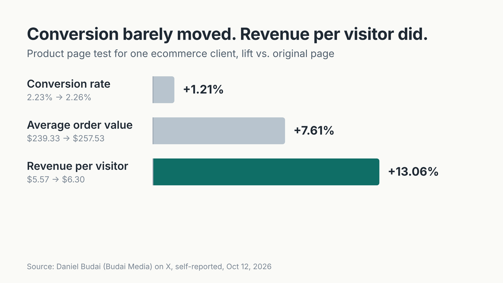
Budai wrote that, judged on conversion rate alone, the test would look like only a small win when it was actually a clear one.
So for product page changes, look at revenue per visitor alongside conversion rate before you decide to keep or drop them.
Match the steps to what you're changing
Back to the art print store on October 25: one fix only needed the right settings page, the other a few lines of CSS pasted into one section. Neither touched how shoppers choose a product, so neither needed the measuring step.
Step four is for changes that sit close to the buy button, like moving the title and price above the image or hiding color swatches. For those, let your own store's add-to-cart rate and revenue per visitor make the call, because a result at another brand won't necessarily repeat on yours.