All stories · Article
PDP teardowns on X repeat one playbook, and rarely show the result
The before-and-after product page posts on X follow one playbook: proof above the buy button, an offer instead of a quantity box, one CTA. It works as a checklist.
Share: WhatsApp · Telegram · X · Facebook · LinkedIn · Email
Eleven teardowns from five Shopify designers, posted between September 12 and October 8, 2026, make nearly identical edits to nearly identical pages.
Same product, same traffic, same pitch
The teardowns share a story before they share a design. The product stays, the traffic stays, and the page takes the credit for whatever changed. @IsmailLate52662 captions one redesign with "Same traffic. Same product." @williamdtc2y opens a post on the same pairing, and @johntech778 leads a supplement teardown with it before showing a single pixel.
In principle that is a fair setup. If nothing else moved, the page is the variable.
It is also a sales pitch. These are portfolio posts. @williamdtc2y closes one redesign by inviting brands that want a better PDP to send a DM. @johntech778 offers a free teardown to anyone who messages the word PAGE, and @Frontend_Prince ends a wellness redesign with a pitch to wellness brands. None of that makes the design advice wrong. It does make the posts advertising.
William | DTC Landing Page Designer & Dev@williamdtc2yBefore → After: Shopify PDP redesign
The before page had the product.
The after page gives shoppers more reasons to buy.
✓ Clearer value proposition
✓ Stronger social proof
✓ Better product options
✓ More upsell opportunities
✓ Clearer path to purchase
I don’t redesign Shopify stores just to make them look better.
I design to reduce friction, improve CR, and create opportunities to grow AOV.
Need a PDP…Sep 13, 2026 · View on X
Proof moves above the buy decision
The most repeated change is moving trust onto the first screen. @SammyLandix4o swaps a cluttered, promo-first hero for a benefit-led one and puts social proof above the fold. @williamdtc2y describes the same move as surfacing benefits and trust signals earlier. In the September 14 post, the same designer puts trust signals ahead of the decision and times reviews to land just before it.
The details change by vertical. The direction does not. @Frontend_Prince stacks a triple trust banner (guarantee, dispatch, worldwide) over a star rating with 1000+ reviews. @johntech778 opens the supplement page with a free shipping bar and replaces paragraphs with benefit icons labeled Metabolism, Fat Burning and Energy. A skincare page from @SammyLandix4o pairs social proof with benefit-led copy and a bold CTA.
The promo banner loses its spot. Proof gets it.
Sammy | Shopify CRO Designer@SammyLandix4oBefore vs After This is what CRO actually looks like: Promo first clutter
1. Benefit-driven hero
2. Social proof ABOVE the fold
3. Clear value + single CTA Same traffic. Higher intent. More conversions. Design for decisions, not decoration. #CRO 📷 #figma #Shopify #Ecommerce https://t.co/lwvgavayJyOct 8, 2026 · View on X
The buy box turns into an offer
The second pattern lives next to the add-to-cart button. Before, it is a quantity selector. After, it is a menu of deals.
@Frontend_Prince's before page is a basic PDP with a quantity selector. The after version has a visual bundle selector tagged Best Seller and Best Value, strikethrough pricing with a savings badge, and four layers of subscription benefits. @johntech778 builds the supplement version: a How Often dropdown feeding a Subscribe & Save block, a price anchored from $29.90 down to $18.90 under a "Save 37%" badge, and a trust stack beneath it listing 20% off, free shipping and cancel anytime.
@IsmailLate52662 adds bundles and Subscribe & Save to a skincare page, and in the other redesign builds the purchase around larger and repeat orders instead of a single bottle. @williamdtc2y lists bundle options and Subscribe & Save as levers for AOV.
The goal these designers name is order value and repeat purchase, more than conversion rate. Their examples are supplements, skincare, wellness and flavored products, things people reorder. A store selling one-off items has fewer reasons to copy the subscription block.
Fewer sections, one next step
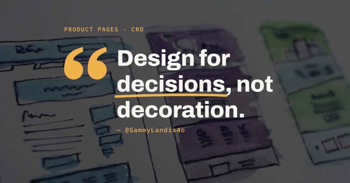
The third change is subtraction. @SammyLandix4o's after page ends on clear value and a single CTA, under a line that could caption the whole trend: "Design for decisions, not decoration."
@williamdtc2y makes the same argument in plainer words: "Shopify design isn't about adding more sections." In another rework, purchase options become easy to compare, flavor selection becomes obvious, and the "CTA is impossible to miss."
Fewer things compete with the button. The shopper gets one question at a time.
What the screenshots don't prove
The numbers in these posts are the designers' own, and they arrive as headlines. @Frontend_Prince titles the wellness post "Wellness brand product page redesign = 628% AOV increase." The same post says subscription is worth 6x the lifetime value of a one-time purchase. Both are the designer's figures, presented as a single percentage and a single multiple.
@johntech778's headline promises "37% more perceived value." That 37% is the same number printed on the page's "Save 37%" badge: a discount, not a measured lift. @IsmailLate52662 states the outcome of a PDP rework as "Higher Conversion Rate (CR)" and higher AOV.
Measured results read differently. On September 19, @dashboardlim described a project for a client with hundreds of product descriptions across two stores. AI rewrote the descriptions, comparison tables, FAQs and image alt text. Drafts were reviewed on a hidden copy of the store. Then live traffic was split between the original page and the rewrite, and @dashboardlim reports 23.75% higher revenue per visitor. The change was copy, not layout, and the figure is the agency's own report. It still comes with a control group.
@alex_momeni reports that a listicle funnel took Earthling Co from 4.5% to 6% CVR. That page sits before the PDP, so it says little about product page layout. It does name the brand and give both rates.
A screenshot shows a change. A split test shows a result.
Checking a PDP against the pattern, one change at a time
The repeated edits make a usable audit list. Store owners can check their own product page for:
- Reviews, star rating and trust signals (guarantee, shipping) on the first screen, ahead of any promo banner
- Benefits a shopper can scan in seconds, not only specs
- A buy box with bundles or Subscribe & Save, if customers reorder the product
- A clear price anchor, old price against new
- One primary CTA, with no section competing with it
The list cannot say which item moves revenue for a given store. Redesigning the whole page at once makes that impossible to learn, because every change lands together.
The part worth copying from @dashboardlim is the method, not the AI. Keep the original page live, send part of the traffic to a version with one change, and compare revenue per visitor. Start with the cheapest edit on the list, likely moving reviews above the fold, and let the split test decide whether it stays.
Sources
- https://x.com/IsmailLate52662/status/2100536272250884324
- https://x.com/williamdtc2y/status/2099369932127408368
- https://x.com/johntech778/status/2101066678394409024
- https://x.com/williamdtc2y/status/2099196250637660161
- https://x.com/Frontend_Prince/status/2102036061366939763
- https://x.com/SammyLandix4o/status/2108229764385587705
- https://x.com/williamdtc2y/status/2098753942872105038
- https://x.com/SammyLandix4o/status/2101719881150308555
- https://x.com/IsmailLate52662/status/2099520861438919133
- https://x.com/williamdtc2y/status/2099394397984924025
- https://x.com/IsmailLate52662/status/2101750385937715384
- https://x.com/dashboardlim/status/2101390400292290676
- https://x.com/alex_momeni/status/2102065399156056497