All stories · Article
Shopify advertorial page: what goes on it and how to test it
A Shopify advertorial page is an article-style page that sits between a social ad and your product page. It suits buyers at the first 2 of 5 awareness levels: [it names their problem, explains the fix, then hands them to your Shopify checkout.]{orange}
Share: WhatsApp · Telegram · X · Facebook · LinkedIn · Email
We read the pages Google showed for "shopify advertorial page" on 25 October 2026.
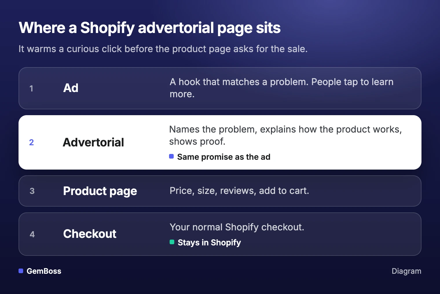
Of the eight results, six would open, and three of those are app listings. One traces the path from ad to checkout. None explains how to label the page as an ad, which buyers it suits, or how to test it against your product page. Here is the path the page sits on.
What is a Shopify advertorial page?
An advertorial page reads like an article and works like a sales page. It is a type of landing page built for one ad and one promise. It shows readers their own problem, explains how the product solves it, and only then sends them to the product page with the ad's promise intact. A pre-sell page is any page between the ad and the product page; advertorials, listicles, comparisons and quizzes are all pre-sell pages.
Your product page assumes the visitor already wants the product, so it leads with price, size and reviews. Many people who tap a social ad were not shopping when they saw it. They saw a hook that matched a problem and wanted to know more.
A buying page is the wrong first stop for that visitor.
When should an ad send people to an advertorial?
Send a click to an advertorial when the person knows little about the problem or the fix. Copywriter Eugene Schwartz described five levels of buyer awareness in Breakthrough Advertising (1966). Copyblogger's Brian Clark summarizes them as running from "completely unaware" to "the most aware", a prospect who "only needs to know 'the deal.'" (Copyblogger) Match each level to a page like this:
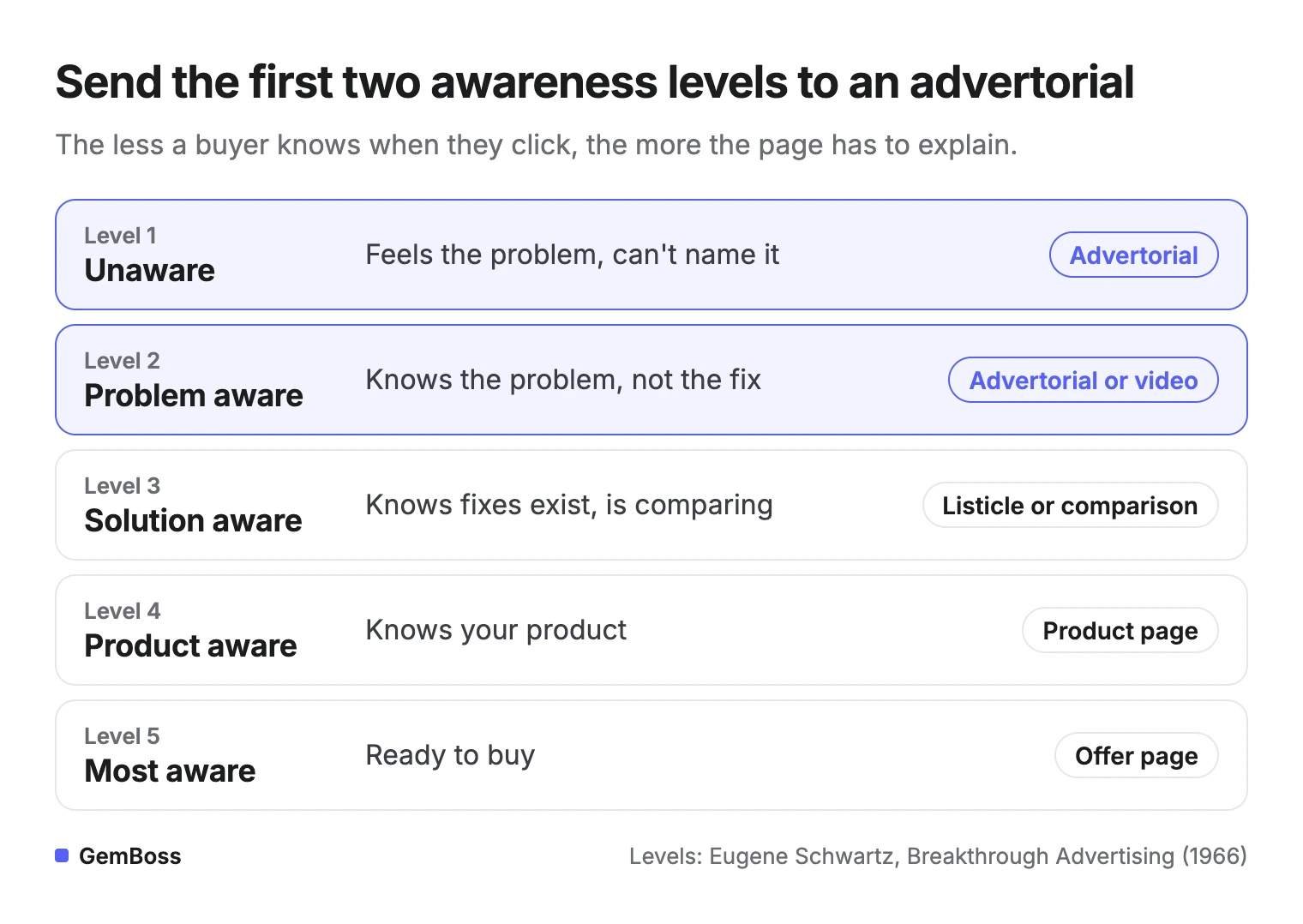
Nick Theriot put the rule in one line on X: "If buyer = unaware → advertorial. If buyer = problem-aware → advertorial or VSL." A VSL is a video sales letter.
Nick Theriot@nicktheriot_Stop overcomplicating which landing page to build.
It's literally:
If buyer = unaware → advertorial
If buyer = problem-aware → advertorial or VSL
If buyer = solution-aware → listicle or pre-sales page
If buyer = product-aware → product page
If buyer = most-aware → offer + buy button
That's the whole bible.
You just don't wanna accept it cuz it's boring.Aug 28, 2026 · View on X
To use this, sort your ads by their hook, not by their audience:
- Problem hooks ("why your skin feels tight by 3 pm") reach unaware and problem-aware people. Send them to an advertorial.
- Comparison hooks ("3 serums that don't sting") reach solution-aware people. Send them to a listicle or comparison page.
- Product and offer hooks ("the Radiance Serum, 20% off") reach people who know you. Send them to the product page or an offer.
Unbounce's advice is to "match the messaging on your landing page with the messaging you're using in your ads."
If the ad talks about a morning routine and the page opens with ingredient science, the visitor feels the switch and leaves.
What goes on an advertorial page?
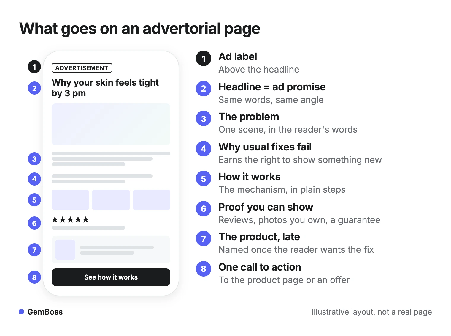
A good advertorial follows the same order, top to bottom:
- A clear ad label, above the headline (next section).
- A headline that repeats the ad's promise. Same words, same angle, so the visitor knows they landed in the right place.
- The problem, in the reader's words. One short scene, two or three lines per paragraph on a phone.
- Why the usual fixes fail. This earns the right to introduce something new.
- How it works. The mechanism in plain language, in a few short steps.
- Proof you can stand behind. Reviews you can show, photos you own, a guarantee. Leave out any number you cannot source.
- The product, introduced late. Name it once the reader wants the fix.
- One call to action. Send them to the product page or an offer that carries the same promise.
Keep the first screen light.
In Unbounce's sample, 83% of landing page visits happened on a mobile device. Nielsen Norman Group found that easy passages read about as fast on mobile as on a computer, while hard passages took longer (NN/g). Keep the mechanism simple. Ad clicks arrive from a feed, between two other things, so the headline and the first lines of the story have to hold attention on their own.
Label the page as an ad
An advertorial is designed to look like editorial content, which is exactly why it needs a label.
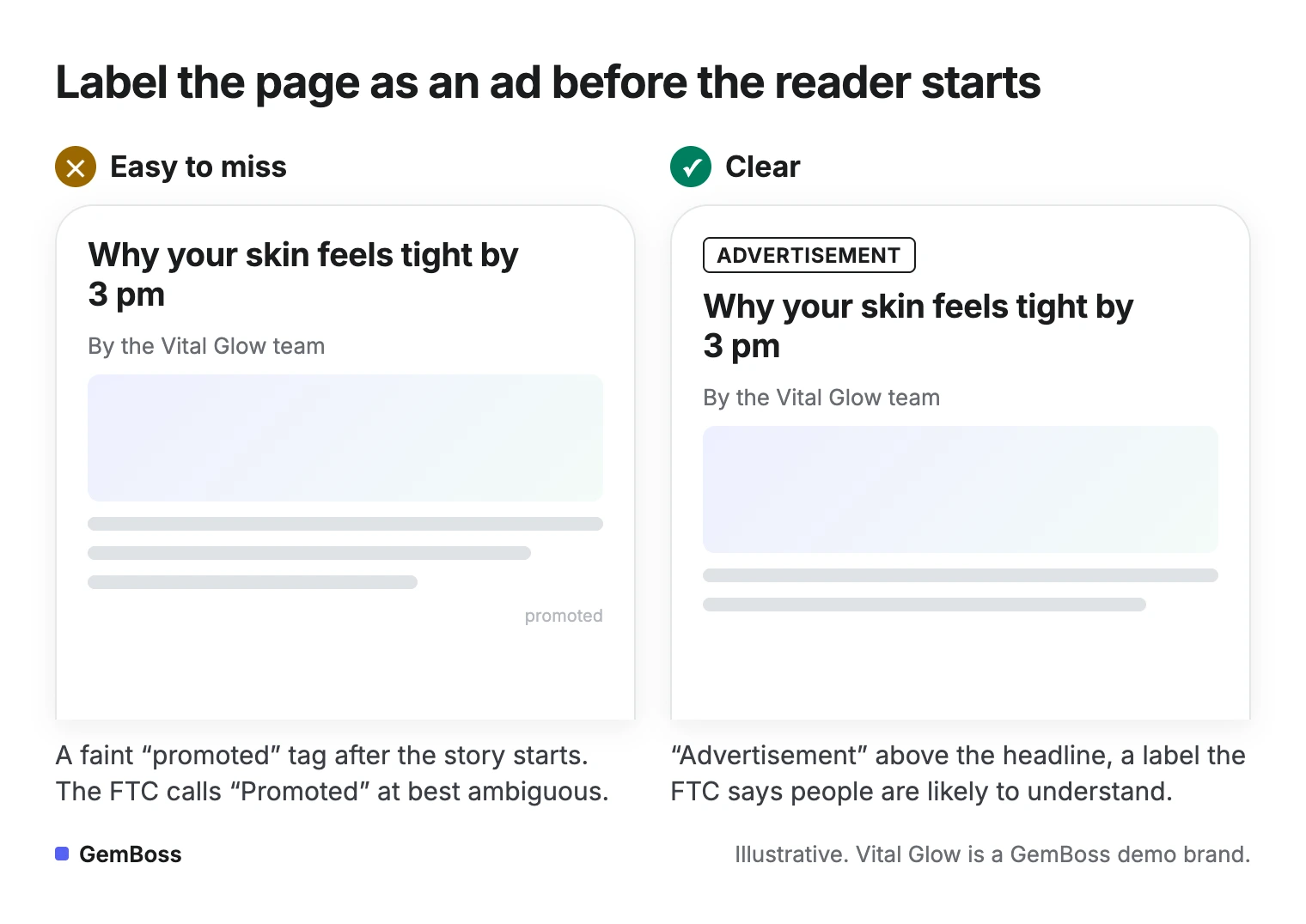
The U.S. Federal Trade Commission's guide to native advertising says an ad "shouldn't suggest or imply to consumers that it's anything other than an ad," and that this covers the page the ad clicks through to. It lists labels people are likely to understand, such as "Ad," "Advertisement" and "Paid Advertisement," and advises: "Place disclosures in front of or above the headline" (FTC).
The word "advertorial" is a weak label on its own. In the FTC's policy statement on deceptively formatted ads, the Commission describes a case where it alleged a news-style format was deceptive "despite the presence of a small-print disclaimer 'Advertorial'" (FTC policy statement).
On a phone, the difference looks like this:
Ad platforms check the same promise from their side. Meta's advertising standards say "the products and services promoted in an ad must match those promoted on the landing page" (Meta).
Templates, examples and free options
Most results for this keyword are apps and templates. They save layout time, and some apps also draft the copy with AI. Whoever writes it, the page has to sell the same promise as the ad that sent the click.
For real examples, open Meta's Ad Library, find ads in your category that have been running for weeks, and follow their links to the pages behind them. Skip any page dressed as a news site. Borrow the order of the parts and write your own words.
Here is Clarifion's advertorial for its plug-in air ionizer, drawn as blocks.
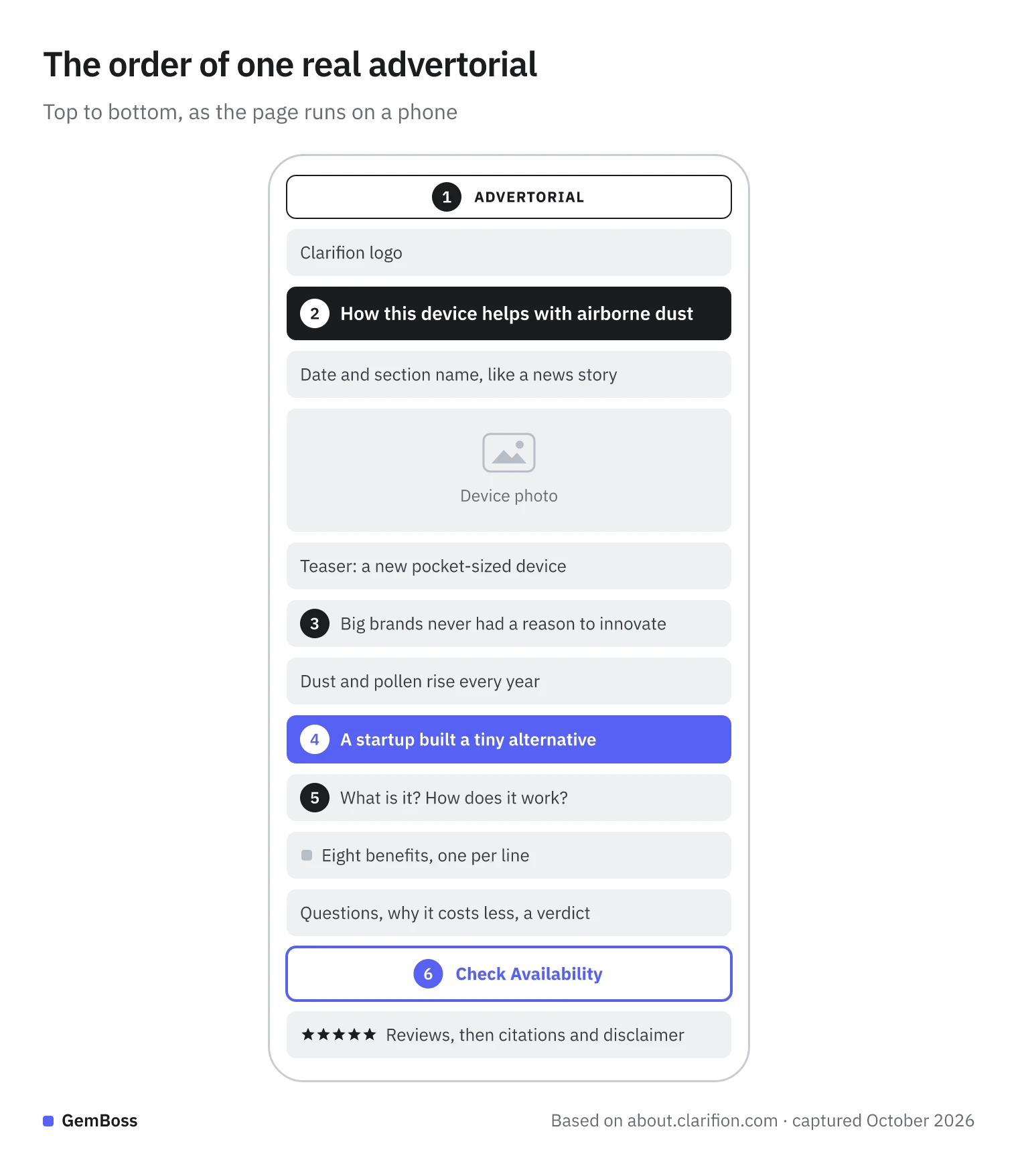
- An "Advertorial" label above the headline: the right place, though on your own page the plainer "Advertisement" is the safer word.
- A headline about the problem the device helps with, under the brand's own logo rather than a made-up news name.
- The opening argues that big brands never had a reason to innovate or lower their prices.
- The brand and its device arrive in the opening paragraphs, early rather than late.
- Then how it works, the benefits, a few questions and why it costs less.
- One destination: every link in the story goes to the same place, and the story's own button comes near the end, with reviews after it.
Two changes from the order above stand out: the product arrives early, and the reviews come after the button rather than before it. Naming the product early is a fair choice for a device many readers won't have seen. Keep the order that suits your angle, test it, then choose where the page will live.
| Option | What it costs | Where the page lives | Testing one angle against another | Best for |
|---|---|---|---|---|
| Theme page template | Free | Inside your theme | By hand: one page per angle, split the ad in your ads manager | A first test |
| Page builder app | Free plan to monthly fee | Inside your theme, or hosted by the app | Some have A/B tests built in, others pair with a testing app | Teams that design inside the theme |
| Funnel layer on top of Shopify | Paid plan | Ships on top of the store | Built in, one path per angle | Brands running many angles |
In all three, checkout stays in Shopify.
Build one for free
To start for free, create a page in Shopify, pick a page template for it from the Theme template menu in the page editor, and build it from text and image sections (Shopify Help Center). Creating new templates needs an Online Store 2.0 theme.
One catch: in Shopify's words, "any changes you make to a template impact all the pages that use that template." Give each angle's advertorial its own template so editing one does not change the other.
A plain page is fine for a first test.
Does a pre-sell page beat the product page?
Sometimes, and only your own test can tell.
None of the pages we read shows a test of the two. One seller on X reported a "23% lift in landing page conversion rate" after testing a pre-sell page against sending traffic straight to the product page. That is one store's page metric, not sales, so treat it as a reason to run your own test.
navuud@navuudSTEAL this page immediately
over the last 2 weeks i've been testing a presell page against direct to product page
the results:
23% lift in landing page conversion rate
whether you're doing ecom or vibe coding an app, send your bot this page
https://t.co/odV8Gg8xmrSep 22, 2026 · View on X
For a rough yardstick, Unbounce's benchmark of more than 41,000 landing pages puts the median conversion rate across industries at 6.6% (Unbounce), and its ecommerce median is lower. A "conversion" there can be a sign-up as well as a sale.
Here is the setup:
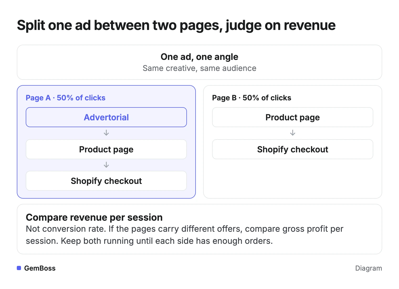
- Run the same ad to two pages: the advertorial and your product page.
- Split traffic evenly with your ad platform's A/B test.
- Judge on revenue per session rather than conversion rate. If the pages carry different offers, compare gross profit per session.
- Keep both running until each side has enough orders to compare.
Test one angle against another
The A/B testing playbook covers sample sizes and when to stop.
Check speed too: a slow advertorial loses the curiosity that brought the click (page speed and conversion).
Frequently asked questions
Is an advertorial page the same as a landing page?
It is a type of landing page. An advertorial reads like an article and is built for people who do not know your product yet. A product landing page is built for people who are ready to buy.
Do I have to label an advertorial as an ad?
If your page looks like an article, label it. The FTC's guidance points to plain labels such as "Advertisement" placed in front of or above the headline, clear on every device. A logo or the word "advertorial" on its own is not enough. Check the rules in each country you sell to.
How long should an advertorial be?
Long enough to tell the problem, the mechanism and the proof, and no longer. For ecommerce landing pages, Unbounce's data points to 285 to 930 words (Unbounce). Advertorials often run longer because they tell a story, so test length like any other change.
Can I build a Shopify advertorial page for free?
Yes, with a theme page template (see above). A builder app or a funnel tool saves time once you run several angles.
Can I run several advertorials at once?
Yes. Give each ad angle its own page and its own tracked link, so the results do not blur together. If your store isn't converting yet, fix the product page first.
Sources
- Copyblogger · copyblogger.com
- https://x.com/nicktheriot_/status/2093305402674893247
- NN/g · nngroup.com
- FTC · ftc.gov
- FTC policy statement · ftc.gov
- Meta · transparency.meta.com
- GemPages guide to advertorial and listicle pages · help.gempages.net
- Meta's Ad Library · facebook.com
- Shopify Help Center · help.shopify.com
- Online Store 2.0 theme · help.shopify.com
- https://x.com/navuud/status/2102478479073907010
- Unbounce · unbounce.com
- ecommerce median · unbounce.com
- A/B testing playbook · gemboss.ai
- page speed and conversion · gemboss.ai
- isn't converting · gemboss.ai