All stories · Article
Where to show shipping costs: product page, cart drawer or checkout
Where should shipping costs show up so shoppers aren't surprised and the product page stays clean?
Share: WhatsApp · Telegram · X · Facebook · LinkedIn · Email
A store owner asked exactly that in the Shopify Community on October 31, 2026, and the replies landed here: a fixed or free-over-a-threshold fee gets one short line under the price, while a fee that changes with address, cart or warehouse gets an estimate in the cart drawer.
But a layout change is only worth making if shipping is where shoppers leave. So the first job isn't editing the page. It's counting how many shoppers saw the shipping cost and still walked away.
The question came from GetOonion, in a Shopify Community thread. Showing shipping should cut surprise at checkout, they wrote, "but it also adds clutter near the Add to Cart button."
They asked where it should go: under the price, in a collapsible tab, or in the cart drawer.
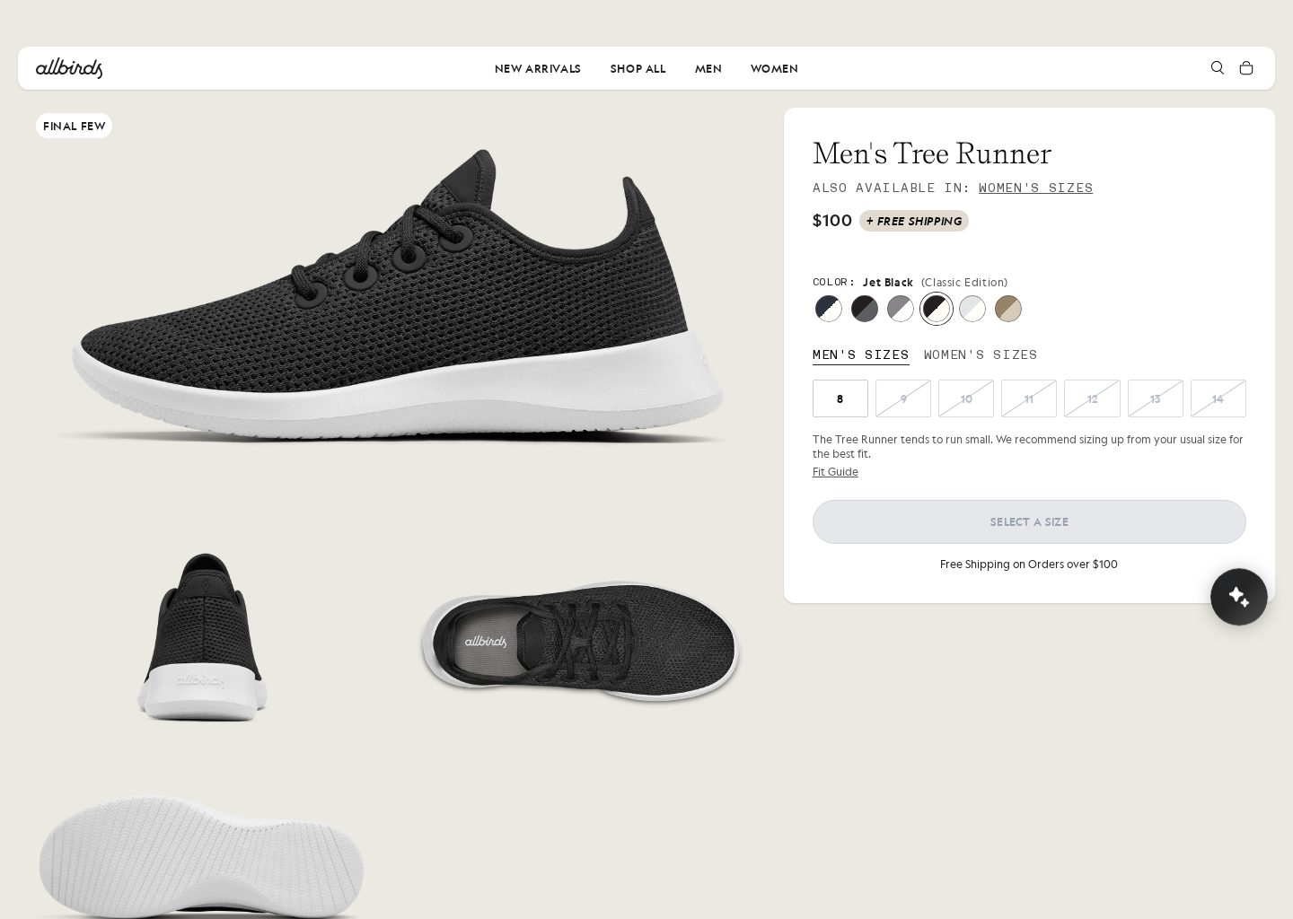
The first screen of an Allbirds product page, captured in November 2026: shipping appears beside the price and again under the button.
Four members answered between October 31 and November 1, 2026: Hannah_Davis1, PavelElektraset, Parselab-Luna and Sajidapex. They don't agree on every detail, but they lean the same way. Where shipping goes depends on whether your store can state the number up front.
One limit up front. Nobody in the thread reported a test result or an abandonment figure. What follows is the community's thinking, not measured results.
"Always show shipping before checkout" doesn't tell you where
Most advice on this stops at telling you to show it early.
- A LinkedIn post. @khadija-haseeb- listed shipping costs that appear too late as one reason people visit product pages and don't buy (October 14, 2026). The post's advice: make pricing and delivery information easy to find, and check the mobile experience.
- A cart-app maker's checklist. Ninety9, a company that builds cart apps, put shipping first in The Shopify Cart Abandonment Checklist (May 19, 2026): "Put an estimate in the cart, or a flat rate on the product page, or a free shipping threshold."
- Another cart-app maker. Cartylabs, which also makes cart apps, goes further in How Transparent Shipping Fees Save Your Shopify Checkout Conversions (June 26, 2026): show shipping everywhere, from a bar at the top of the page to the shipping step of checkout.
All three agree shipping shouldn't be a surprise.
None of them says which spot suits a flat fee and which suits a fee that changes with every address. The thread goes one step further: it ties the spot to how you charge.
Count the shoppers who saw shipping and still left
In the thread, this was proposed as the first move before any layout change (PavelElektraset raised it).
- Open Orders > Abandoned checkouts in your Shopify admin.
- Go through the last few weeks.
- Count how many already have a shipping address.
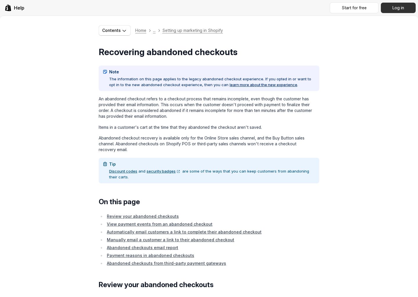
Shopify's help page "Recovering abandoned checkouts" on help.shopify.com, captured in November 2026. The page says it covers the legacy abandoned checkout experience, so your admin may look different.
Why the address matters: a shopper who entered one got far enough to see the shipping price and still left.
You will see one of two pictures:
- A big share have an address. Shipping surprise is likely one of your causes, and an earlier estimate should help. Go to step 2.
- Most stopped before the address. A shipping line probably won't move abandonment much. The thread suggested looking at trust or price first.
The thread gave no cut-off for "a big share." Judge it against your own list.
Is your fee fixed, or does it change with the cart and destination?
Here the replies meet: where the fee goes depends on how predictable it is. Products that ship from different locations, or have different shipping requirements, can push the final charge above what a shopper expected.
So test before you write any number on the page:
- Build a few cart combinations your customers often order.
- Check each one against a few delivery destinations you ship to.
- Note the shipping charge every time.
You will see one of two results:
- Fixed: the fee stays the same, or is free above your threshold, for most carts. Go to step 3a.
- Variable: the fee moves with the products, the warehouse or the destination. Go to step 3b.
If the fee is fixed: one line under the price, details in a tab
For this group, three members (Hannah_Davis1, PavelElektraset, Sajidapex) offered different layouts that share one idea: a short line near the price, with the detail kept elsewhere so the page stays uncrowded.
The example lines they used:
- "Free shipping over $75", placed near the Add to Cart button.
- "Shipping from $5, calculated at checkout", for stores with a starting rate.
- "Free shipping over $75 · Ships in 2–4 days", pairing the fee with a dispatch time.
Full rates go in a collapsible tab. Sajidapex added two details: call the tab "Shipping & Returns" and cover delivery times and returns in it, and put a free-shipping progress bar in the cart drawer. Sajidapex's reasoning was that shoppers care when the order arrives, not only what it costs.
The $75, $5 and 2–4 days are example wording. Write your own fee, threshold and dispatch time.
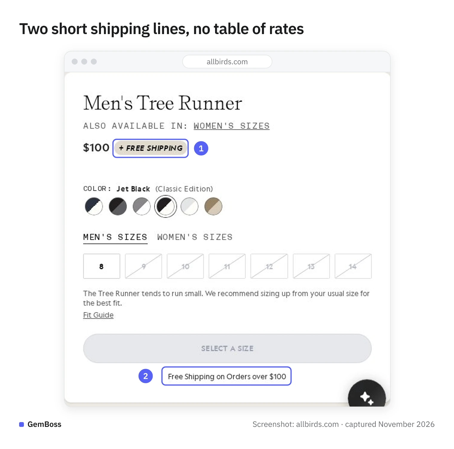
- A short badge sits right next to the price.
- One line under the buy button states the free-shipping threshold.
There is no rate table in this buy box. Full rates and delivery times are what the members would move into a collapsible tab.
You'll know this step is done when your page shows one true sentence about shipping, and the details sit one tap away.
If the fee changes: explain how it's worked out, estimate it in the cart drawer
For this group, the product page shouldn't promise one number.
Three members (Hannah_Davis1, PavelElektraset, Parselab-Luna) lean toward an estimate in the cart drawer. The shared reason: the final cost depends on the delivery address and what is in the cart, so a single figure on the product page implies more certainty than the store has.
What to do, in order:
- Leave any fixed shipping figure off the product page.
- Explain how the charge is worked out: by destination, by order size, or by where each product ships from.
- Show an estimated cost in the cart drawer, before checkout.
That way shoppers understand the final price may be higher depending on location, order size or product mix, and aren't surprised when they pay.
You'll know this step is done when the product page makes no promise the cart can break.
Open the page on your phone before you save
Sajidapex advised checking the new layout on mobile. Most shoppers will see it there, and that is where clutter near the button shows up first.
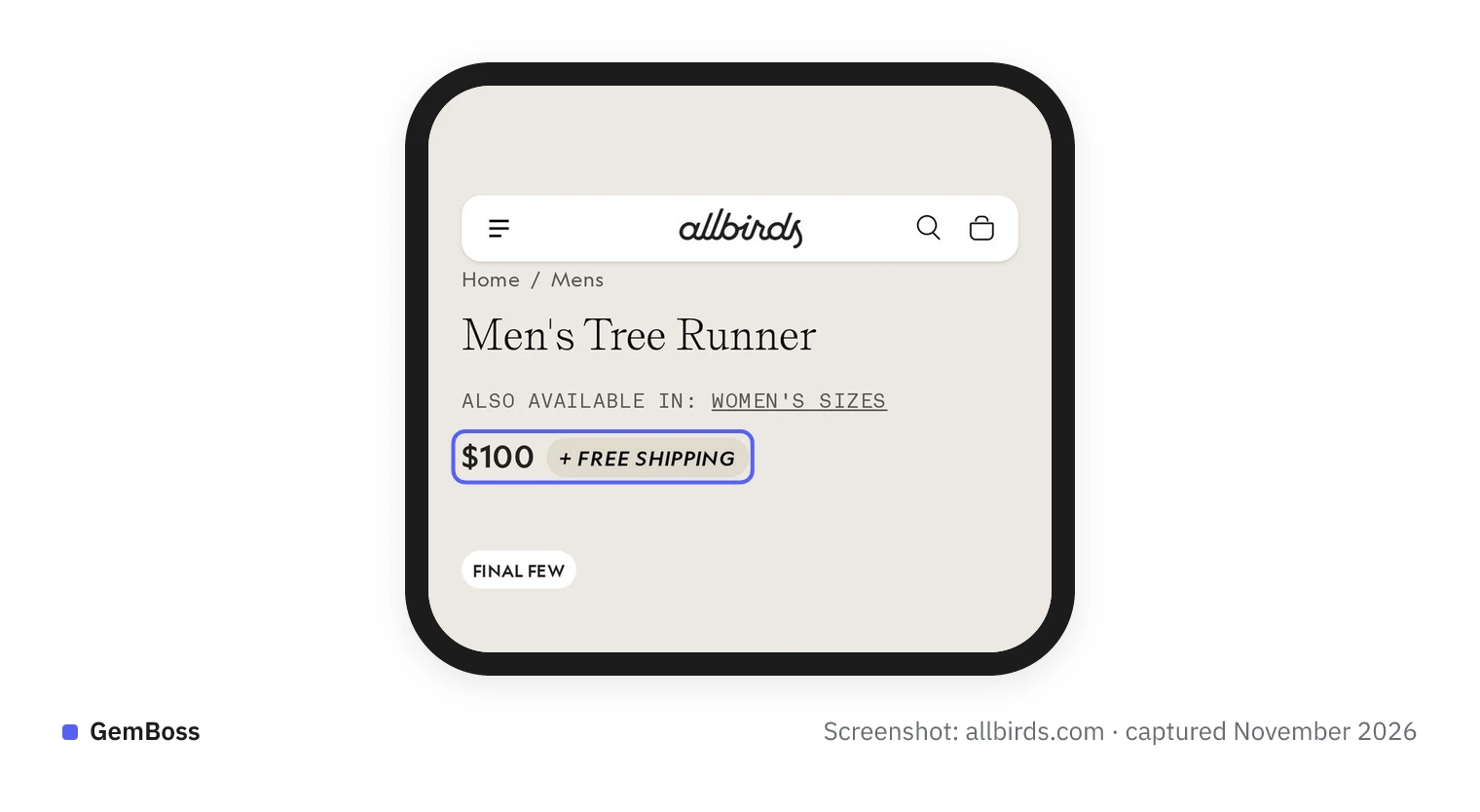
The same Allbirds page on a phone, captured in November 2026: the shipping badge still fits on the price line.
You will see one of two things:
- The shipping line fits on one line and the Add to Cart button stays where it was. You're done.
- The line wraps or pushes the button down. Shorten the wording, or move the extra detail into the collapsible tab.
How do you know the change worked?
The thread's measure: compare checkout completion, not sales, across two equal periods before and after the change. PavelElektraset gave the most detail.
- Formula: orders divided by sessions that reached checkout, taken from Analytics.
- Periods: equal length, for example two weeks before the change and two weeks after.
- Keep it clean: no new discount or campaign in between.
- Low traffic means waiting. With few visitors, early swings may be chance, so give it a few weeks before you decide.
Hannah_Davis1 also suggested a before-and-after comparison, adding conversion rate.
It also helps to know which stage you are reading. Ninety9's checklist splits it in two:
- Cart-to-checkout rate: shoppers who created a cart and reached the checkout page.
- Checkout completion rate: shoppers who reached checkout and paid.
Ninety9 ties leaks at the first stage to cost, delivery, trust and cart design. A cart drawer estimate works before checkout, so watch that rate too if you took step 3b.
Common mistakes
- Changing the page before counting. Open Abandoned checkouts first; if most stopped before the address, look at trust or price.
- Copying "$75" from an example. Use your own fee and threshold.
- Promising one fee when the cart changes it. Move the estimate to the cart drawer and explain how it's calculated.
- Testing only one cart. Try a few common combinations and destinations.
- Checking only on desktop. Open the page on your phone before you save.
- Reading sales instead of checkout completion. Use two equal periods with no promotion in between.
Start with one number: open Orders > Abandoned checkouts and count the ones with a shipping address. Then pick a single line under the price if your fee is fixed, or a cart drawer estimate if it isn't.
Sources
- Shopify Community thread · community.shopify.com
- @khadija-haseeb- listed shipping costs that appear too late · linkedin.com
- The Shopify Cart Abandonment Checklist · ninety9.dev
- How Transparent Shipping Fees Save Your Shopify Checkout Conversions · cartylabs.com